Tūhono operate on the belief that Māori share the aspirations as set out in Te Pae Tawhiti and therefore Tūhono is an advocate for, and contributes to a network of Māori individuals, iwi organisations and other entities who engage with each other in fostering:
- Tuakiri (Identity)
- Oranga (Wellbeing)
- Pitomata (Potential)
This strategic vision is to be achieved by a strong desire to provide a valued quality service, continuous innovation and security of information. Our business focus is around data management and strategic networking.
Our Branding
Tūhono’s branding is inspired by the word Tūhono meaning to connect or link, and by Te Pae Tawhiti – the distant horizon. The Tūhono branding is therefore made up of 2 parts:
- The Tūhono Logo and;
- The ‘look and feel’ or korowai which adorns Tūhono – Te Pae Tawhiti
Tūhono logo

The Tūhono logo represents Te Ao Māori (The Māori world) and is in two parts, the Tūhono icon and the Tūhono name:
The Tūhono icon:
The 3 koru spiral spiralling from the centre of the design represents, Tuakiri (Identity), Oranga (Wellbeing) and Pitomata (Potential), and our commitment to fostering these valued principles. The pounamu (or greenstone) motif is utilised in the logo in the acknowledgement that the properties of pounamu never change over time. If a person looked into pounamu 100 years ago, it's look and feel will be exactly the same today. This notion of resilience and strength brings stability and consistency to Tūhono, as if made from Pounamu. A lighter green colour is also depicted in the logo, as if light was shining from the background through the logo. This light represents the light of knowledge and wisdom, radiating into Te Ao Māori.
The Tūhono name:
Tūhono means connect or link and has a deep spiritual meaning within Tikanga. Tūhono can only be used in a positive context and has 2 dimensions:
- Spiritual: connecting of minds and becoming one people.
- Physical: physically joining or linking something.
Te Pae Tawhiti
The design or the look and feel of Tūhono is made up of several elements including, Poutokomanawa ki Te Pae Tawhiti, Mā te manaia ka tū te whakairo, and Ararau ki Te Pae Tawhiti, each element representing a building block to achieving a desired future where Māori enjoy a higher quality of life as explained in Te Pae Tawhiti. The following elements were designed by Derek Lardelli.
Poutokomanawa ki Te Pae Tawhiti
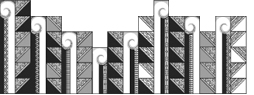
A poutokomanawa is a central part of a wharenui (meeting house) and represents the ancestors of that marae, hapū or iwi. The poutokomanawa is the central support/post within the wharenui and also welcomes guests into the house. Poutokomanawa ki Te Pae Tawhiti as illustrated here represents the central post to reach Te Pae Tawhiti or the distant horizon. The four distinct pou (poumua, pouroto, poumuri and pouwaho) illustrate the spiritual, intellectual, emotional and physical power needed to gain social, cultural, economical and political strength.
Mā te manaia ka tū te whakairo
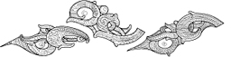
The manaia is a spiritual guardian, provider and protector from evil. As a supernatural being, the manaia usually has a head of a bird, body of a man and tail of a fish, but always with fierce facial expressions, and depicted in side profile - part in the spiritual world and part in the physical world. On our journey towards Te Pae Tawhiti, the manaia (as a precious symbol) provides positive and active role models within our whānau, hapū and iwi. Also, Tūhono means to link or connect and has 2 dimensions - a physical and spiritual, similar to the manaia.
Ararau ki Te Pae Tawhiti
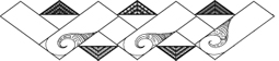
Ararau ki Te Pae Tawhiti, or the road to Te Pae Tawhiti, journeys toward a well-educated people and hence the realisation of one's full potential.
The green colour was chosen to represent the natural cycle of life, we are born, we live and prosper and eventually we die. Whether this be the children of Paptūānuku, (Earth Mother) trees and plants, or people from birth to death.
The horizontal lines are reminiscent of Te Pae Tawhiti, and the colours used are yellow, representing Tama-nui-te-rā (the sun), and red, the blood of our people. The words identity, wellbeing and potential, echo in the background along with pono (trust) and tāwharau (security), as these are aspects all engrained in the Tūhono brand.